Most accessibility failures come from a few repeatable mistakes: broken heading structure, missing alt text, low color contrast, uncaptioned video and image-only PDFs. A small team can fix these across a website, email program and core documents in roughly one week of focused work.
A practical digital accessibility checklist for small teams: alt text, headings, contrast, captions, accessible PDFs, and free testing tools you can apply this week.
By Editorial teamPublished Last updated 10 min read
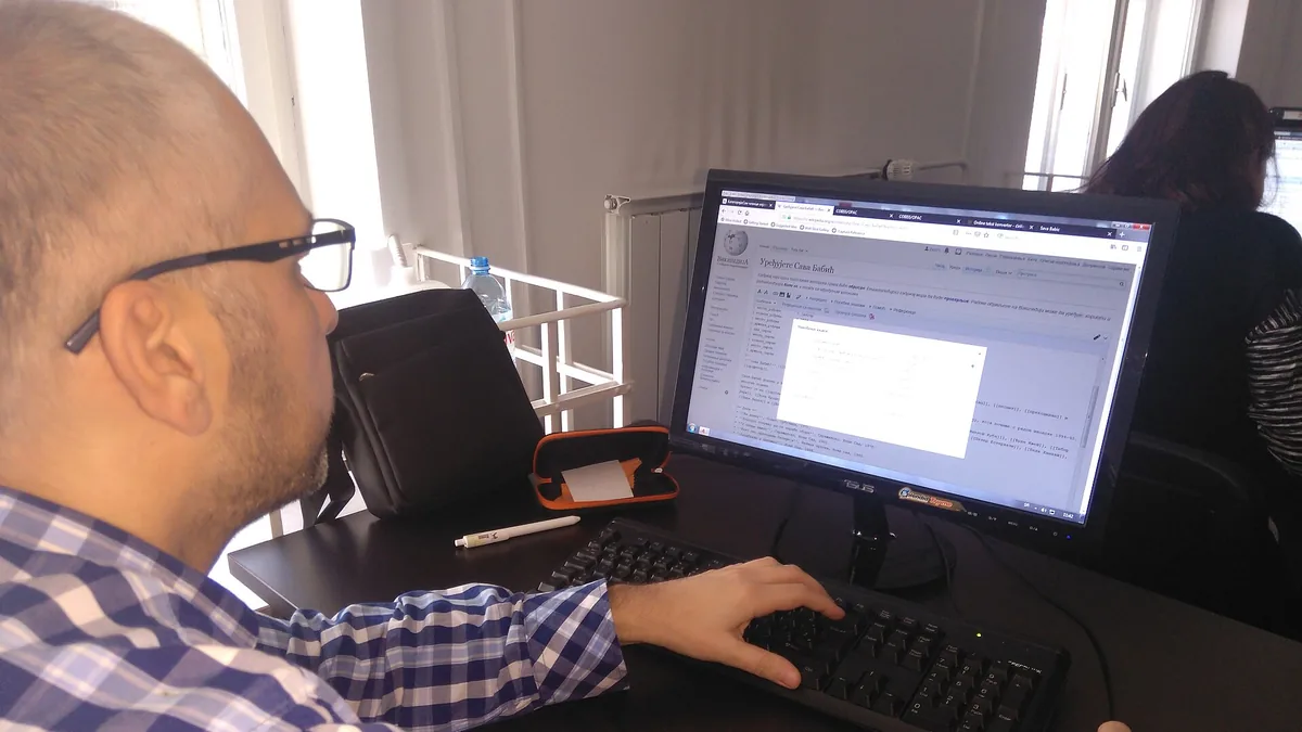
Man works on computer at University Library, Belgrade during 2019 1Lib1Ref workshop Photo: Ivana Guslarevic, Wikimedia Commons, CC BY-SA 4.0.
Accessibility problems are usually caused by a small set of repeatable mistakes: missing alt text, broken heading structure, low color contrast, uncaptioned video and image-only PDFs. A small team can fix the majority of these across a website, email program and core documents in about a week of focused work. This checklist prioritizes the high-impact, low-effort fixes first, in the order that helps real users the most.
The usual disclaimer applies: this is not a legal compliance audit. It is a practical starting point based on widely used international accessibility guidelines, commonly called WCAG, which most accessibility laws reference. If you take payments from the public, receive government funding, or serve people with disabilities directly, treat this checklist as step one rather than the finish line.
In what order should a small team fix accessibility issues?#
Not every accessibility fix matters equally. Some changes take five minutes and help thousands of people; others take days and help almost no one. A small team working in the sequence below can remove most barriers on a typical site within about a week. Work through this order:
Headings on your main templates (2 hours): your homepage, main service pages, donation page and email templates.
Alt text on meaningful images (2 to 3 hours): photos, logos with text, infographics and buttons.
Color contrast on primary brand colors (1 hour): buttons, links and body text.
Captions on your top-viewed videos (2 to 4 hours): anything with meaningful traffic.
Accessible PDFs for documents people must use (3 to 5 hours): applications, forms and event flyers.
A testing pass with free tools (2 hours): automated checks plus one manual keyboard walkthrough.
If you only complete the first three items, you have already removed most of the barriers on a typical small-organization site. The rest compounds over time.
A related starting point: our small business technology guide covers how to sequence broader technology decisions if accessibility is one of several projects on your plate.
Alt text is the short written description attached to an image that screen readers read aloud and that appears if the image fails to load. Good alt text answers one question: what does a sighted visitor gain from this image? In other words, describe the function or meaning of the image, not its surface appearance.
Write alt text in plain language, under about 125 characters, and describe the function or meaning of the image:
A photo of your team at an event: “Staff and volunteers at the spring food drive” not “photo of people.”
A button that says “Donate”: the button text is already accessible, so no alt text is needed.
A chart showing donation growth: “Donations grew 40% between 2023 and 2025” or, better, put the numbers in the page text and give the chart alt text like “Chart of yearly donations, figures listed in text above.”
How are decorative images and linked images handled?#
Two special cases trip people up:
Decorative images (backgrounds, divider lines, stock photos that carry no information): mark them as decorative rather than writing alt text. Most content management systems have an option, or use empty alt text (alt="").
Logos and linked images: if the logo links to your homepage, the alt text should be “Home” or your organization’s name, not a description of the graphic.
How should heading structure be set up for accessibility?#
Screen reader users and keyboard users navigate by headings, the same way a sighted person might skim a page. If a page’s headings are out of order or purely visual (just bold, large text), that navigation breaks. Correct heading structure is the backbone of accessible navigation.
The rules are simple:
Every page has exactly one H1, matching the page title.
Headings below it step down in order (H2, then H3), with no skipped levels.
Bold or large text that is not a heading is fine, but do not use heading styles to make text bigger for no reason.
The fastest way to check a page: many screen reader testing tools and browser extensions offer a “headings list” view. Open your homepage and main templates, and read the list. If it reads like a sensible table of contents, the structure is fine.
Emails need this too. Most email tools (Mailchimp, Constant Contact, and similar) use heading blocks rather than raw HTML, so the structure usually works if you use the designated heading blocks instead of just making paragraph text larger.
Contrast problems are usually baked into a brand palette, which means fixing them once fixes them everywhere. WCAG’s commonly referenced thresholds are 4.5:1 for normal text and 3:1 for large text (18 point or larger, or 14 point bold). Check the brand palette once, then reuse the results.
Use a free contrast checker (WebAIM’s contrast checker is the standard free tool) and test:
Body text on your background color
Button text on your button color
Link text on your background, since links are often the same color as body text but smaller
White text on photos or colored banners, which frequently fails
Common problem
Typical cause
Quick fix
Grey text at low contrast
“Modern” minimal styling
Darken the grey one or two steps
Link text indistinguishable from body text
Same color, no underline
Add underline on hover and focus, or use a distinct link color
Text over busy photos
Hero banners with overlaid text
Add a dark overlay behind the text
Small white text on accent color
Brand yellow or light green buttons
Switch button text to a dark color
One caution: do not rely on color alone to convey meaning. A form that marks errors only in red will be invisible to the one in eight men with some form of color vision deficiency. Add an icon or a text label (“Error: email is required”).
Captions should start with the videos people actually watch. Captions help deaf and hard-of-hearing viewers, people watching in sound-off environments (which is most mobile scrolling), and anyone learning in a second language. Auto-captions from YouTube or other platforms have improved dramatically, but they are still a starting point, not a finish line, because they mispronounce names and miss technical terms.
A practical approach:
Turn on auto-captions for every video going forward. This takes minutes.
For your top five or ten videos by views, download the auto-caption file, correct the errors (especially names, product terms and numbers), and re-upload.
Include speaker identification if there is more than one voice.
For live events, auto-captions are the realistic option for small teams, and they are worth using even when imperfect.
PDFs are the most common source of severe accessibility problems because a scanned or image-based PDF is just a picture of text. No screen reader can read it, no search engine can index it, and no one on a phone can resize it comfortably. The best fix is to not use a PDF at all.
If the content can live on a web page, put it there. Web pages are more accessible by default and easier to update. Reserve PDFs for documents people need to print or submit, like forms.
What steps make a PDF readable by screen readers?#
When you do produce PDFs:
Never post a scan. If you have a scan, run it through OCR (optical character recognition) to convert it to real text. Free tools in most operating systems and PDF readers do this.
Export from the source document with tags. When exporting from Word or Google Docs, use the “accessible” or “tagged” export option. These exports carry over heading structure, alt text and list formatting.
Check reading order. In Adobe Acrobat, the free Read Out Loud function (under View) is a quick sanity check: if it reads content in a confusing order, the tags need fixing.
Test text selection. Open the PDF, click and drag to select a sentence. If you can select the text, a screen reader can probably read it. If you cannot, it is an image.
Free tools catch a surprising amount, and no tool catches everything. Use both automated checks and one manual pass.
Automated checks:
WAVE (WebAIM): a browser extension and web tool that flags missing alt text, contrast failures, structural problems. Good for a full-page visual overview.
Lighthouse (built into Chrome DevTools): audits accessibility among other categories; good for one-click reporting.
axe DevTools: a browser extension with cleaner, less noisy reporting than some alternatives.
Manual pass (about 30 minutes):
Unplug your mouse and navigate the homepage with only the Tab, Enter, Space and arrow keys. Can you reach every link, open every menu, and see where the focus indicator is?
Try your site at 200% zoom. Does it reflow rather than requiring horizontal scrolling?
Turn on your phone’s screen reader for five minutes and open your homepage. This is uncomfortable at first, which is the point.
Tool
Cost
Best for
Catches
WAVE
Free
Quick page audits
Alt text, contrast, structure
Lighthouse
Free
One-click scores and reports
Broad technical checks
axe DevTools
Free tier
Cleaner output, fewer false alarms
Most code-level issues
Keyboard-only test
Free
All interactive elements
Focus, traps, hidden content
No automated tool reliably catches missing captions, confusing alt text, bad reading order or keyboard traps. That is why the manual pass matters.
Emails and internal documents need the same accessibility treatment as web pages, because they are where most people actually encounter an organization day to day. A website gets the attention, but everyday content is frequently forgotten.
For email:
Use real heading blocks, not enlarged text
Include alt text on images
Keep link text descriptive (“Read the annual report” rather than “click here”)
Check contrast on any colored text over colored backgrounds
Do not put critical information only inside an image, because many email clients block images by default
For documents (Word, Google Docs):
Use the built-in heading styles rather than manual formatting, and check the document outline view
Use real bullet and numbered list buttons rather than typing dashes
Set alt text on images (right-click options in both Word and Google Docs)
Use the built-in table tools with header rows, not tab-separated text
If a volunteer or contractor helps with this work, the process is smoother when expectations are written down. Our guide to managing volunteer tech help effectively includes a task-briefing template that works well for accessibility passes.
A lightweight publishing checklist keeps new content accessible after the initial one-week pass. The week-one effort fades quickly if new content reintroduces the same problems. Add a 60-second checklist to your publishing workflow:
Alt text on all meaningful images
Headings in order, one H1 per page
Descriptive link text
Captions on video
No critical information only in an image
Color contrast checked for any new brand color
If you use a task board or a shared document for publishing, paste this list into the template so it appears with every new piece of content.
Can I make a PDF accessible without buying special software?
How long does a full accessibility pass take on a small website?
A marketing site with 10 to 20 templates and a handful of key documents can usually be reviewed in a week of part-time work. Ongoing content then needs a lightweight checklist applied each time something is published.
Practical sustainability moves for small offices: extend hardware life, right-size cloud usage, buy greener, and dispose of e-waste responsibly, ranked by effort and impact.